A mobile-friendly website is a website that is viewable and user friendly on a mobile device. The idea is that a mobile friendly site should be just as easy to navigate and view as a website that can be navigated and viewed on a computer. This means that the websites’ images, videos, text, and links should be accessible on any phone’s screen. This concept eliminates the need to pinch and scroll the screen.
In April 2015, Google released its mobile-friendly algorithm. This algorithm responds a “yes or no” in the ranking system. The point of the algorithm is to determine whether a site is a mobile friendly site or not. If Google does not think your website is mobile-friendly, then it will not show up in the searches done on a mobile-device.
In a book called “The Art of SEO: Mastering Search Engine Optimization”, it says “This algorithm would have more of an impact on its search results than either Panda or Penguin. if you want your site’s content to show for mobile queries, you need to build your site for the mobile user experience.”
Some factors to keep in mind while working on your mobile marketing and mobile advertising include the load time of a page, the size of the items on a page, whether the buttons and displays are functional, and double check for redirect errors. Attention is scarce for mobile sites. Mobile users want information quick and easy to access. If the site is not up to speed, then the bounce-rate is going to increase. Therefore, a mobile design should be simple and kept to the bare minimum. This means fewer functions, and less navigation. The buttons and links should also be big enough for the average finger size to click on.
It is important to know the Mobile SEO functions of a website. Knowing the difference between a responsive web design, and an adaptive web design will help to understand how to start a design for a mobile device. A Responsive design, also known as dynamic serving, is controlled by style sheets, JavaScript, and HTML. It uses the same elements to adjust to any screen. It responds in a way so that it looks good and functions at any size. Adaptive design generally has a set of layouts for each different device sizes. It uses a different set of elements for each different layout. This means that it will adapt to the device a person is using.
When considering whether to use adaptive design, or responsive design, don’t forget about the ranking factors. The Google algorithm will actually crawl the site differently if each device has a separate URL. If a mobile site has a separate URL than a desktop, then they will not be associated as the same site. In fact, Google even has different spiders, known as agents, for crawling mobile websites. This could be a good idea if one device’s site is doing better than the other.
Knowing information about Mobile SEO such as separate URLs, and design platforms can be utilized to have an advantage over other mobile sites. There are cases where a website can be more user friendly on a mobile device than on a desktop. For example, Uber is thriving off of their mobile traffic, because they started out as a mobile app then worked their way to becoming desktop friendly. This is not an uncommon trait in 2018. To keep a company successful and competitive, having a mobile friendly website is very important.
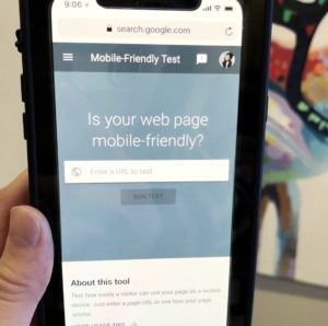
Is your web design mobile friendly? If you would like to check to see if you have a mobile friendly website, then you can click on Google’s mobile friendly test.
If you would like some extra help in making your website mobile friendly, then visit WOMPMobile.